I see this so often I’ve decided to start a channel here to try to educate people on the effectiveness (or not) of using web addresses or URLs in both online and offline situations.
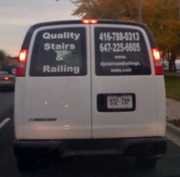
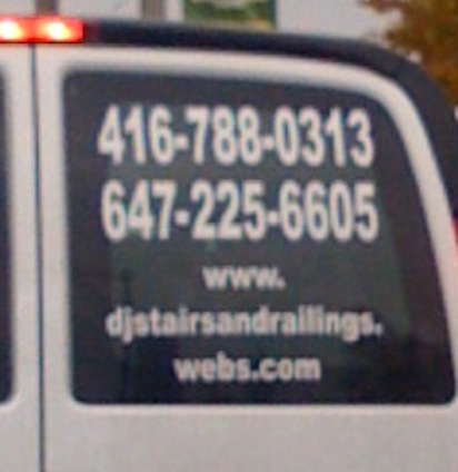
In this installment, I was stuck in traffic behind this van the other day. This URL was staring in me in the face for probably eons longer than any casual observer would ever see it for, yet, I wouldn’t be able to get to this website if my life depended on it:
www.djstairsandrailings.webs.com
In terms of usability, in terms of using a web address as a “call to action” to bring in a prospect for your business, there are so many things wrong with this URL I hardly know where to start.
I’ve read somewhere that the human mind can juggle at most seven “plus or minus 1 or 2” items at any given time. When it comes to URLs I think you have to look at it as “how many opportunities are you giving somebody to make a mistake?” Ideally it’s zero, but for a URL to be effective it can’t be much higher than 1 or 2 before your returns fall off a cliff.
In a web address or URL, every logical syllable or word, every “period” or “dot”, every hyphen, every possible variation (plural or not) is something an end user can get wrong – and in this case it means that somebody who may have been trying to connect with your business will never get there. They’ll wind up somewhere else.
Going back to our example: first, the URL is surrounded by larger font phone numbers, and a business name that doesn’t even match the URL. It’s already information overload. Aside from the fact that the only reason I got close enough to see it was because traffic was stopped, it was still so complicated I got it wrong myself when starting this post (and I deal with URLs every day, memorizing them is second nature). It was good a thing I had a full minute or two in stopped traffic to click a photo. You shouldn’t rely on that for the effectiveness of your web address.
How many things does a user have to keep straight in his mind in order to get to this website?
- www
- [dot]
- dj (was it “dj” or “djs” somebody may ask themselves later….)
- stairs
- and
- railings
- [dot]
- webs (webs? not web?)
- [dot]
- com
That’s 10 elements to this URL. Ten things your potential prospect has to keep straight in their mind from the time they saw this and thought “hey, I need my stairs redone” to the time they get home and get behind a computer and clear through the 35 emails they have waiting for them before they fire up a web browser and try to type the above mish-mash into it.
URLs on sides and backs of vans are “calls to action”. In the olden days, people put phone numbers there. Phone numbers are long strings of numbers and are prone to transposition errors, etc. URLs are supposed to get “it” across better. “It” being your message, your contact info, what you do, you’re unique business proposition.
If you have a complicated business URL, and there are many reasons why this may be the case, then support that with some shorter, more memorable, more usable call-to-action domains, even if all they do is simply URL forward to your main URL.
In this case, the guy could have just emblazoned:
DJstairs.com
across the back and sides of the van, or perhaps:
DJstairs.com
DJrailings.com
and have them both forward to wherever. As it stands now, the poor guy may be wondering why he never gets any business from his website presence.


Leave a Reply