Haven’t posted in this section for awhile (which has been renamed Using URLs Effectively).
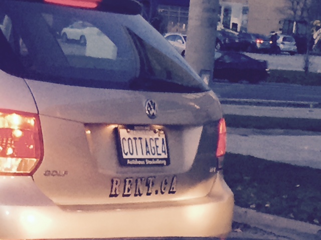
In today’s lesson we see an attempt at a “call-to-action” URL on a vehicle:
My first reaction when I saw this was WOW, does that guy ever have a great domain name! (Because I thought he was advertising rent.ca).
But then I thought about it. Rent.ca sounds like it would be big, like category-killing big. I wouldn’t expect a monster domain like that to be plastered across the back of somebody’s car in makeshift lettering. It happens, but rarely.
(Turns out I was right, rent.ca is owned by eBay’s Kijiji subsidiary.)
I took another look and saw the license plate. Waitaminute, when you combine the vanity license plate with the domain name stencilled across the bottom you would get cottage4rent.ca. Could that be “the URL” this person is trying to promote?
Probably. And it illustrates a mistake I see made not only by small business owners but large corporations and ad agencies who buy up tonnes of billboards and make the same mistake: the mistake is splitting your call-to-action URL into multiple graphical elements to satisfy some design or creative impulse but completely mangling the readability and thus the effectiveness of the URL.
Keep in mind, this is all happening in traffic – only a obsessive compulsive domain geek would expend this much mental energy on it, everybody else will simply fail to register the call-to-action URL in their minds.
Remember back in the very first post in this category, (this should be your mantra):
In a web address or URL, every logical syllable or word, every “period” or “dot”, every hyphen, every possible variation (plural or not) is something an end user can get wrong – and in this case it means that somebody who may have been trying to connect with your business will never get there. They’ll wind up somewhere else.
We could expand this to include the fact that every font change, every colour change, every visually “sectioning off” of one part of the URL from another gives the target another chance to misunderstand your message and either forget the call-to-action or get it wrong when they try it.
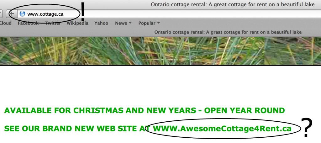
In our example today, what I thought would be a simple straight-forward lesson got even hairier when I tested my thesis that the URL being advertised was, in fact cottage4rent.ca:
It turns out that cottage4rent.ca redirects me and I wind up on cottage.ca (!) and looking at a message asking me to visit some other website entirely, but it isn’t even hot-linked, and doesn’t auto-redirect like the original URL did. Not to mention that out of all the URLs (three by my count) involved in landing here, the one I’m now supposed to type into my browser location bar is the crappiest URL of them all …..and…..
It’s all sitting on what is a monster domain: COTTAGE.CA!
Wow. All they really need to do is get rid of everything, put cottage.ca on the back of the car and they’re done. Problem solved.


Leave a Reply